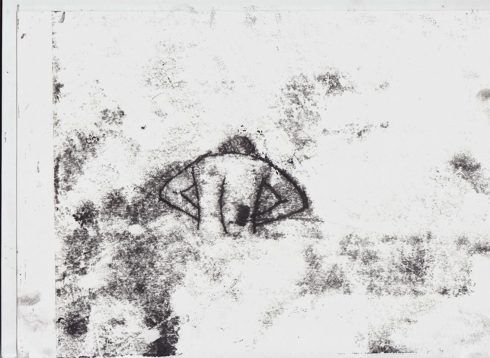
I have experimented with mono-printing further by using my primary images of chairs and children's toys to create different compositions and designs for my children's illustration. I am really drawn to mono-printing as the effect and presentation that it has links to the theme (depression) of my children's book very successfully.
 |
| Most Successful |
I think that the last mono-print is the most successful as it represents the theme (depression, loneliness) and it relates to the target audience (children and parents). The simple chair and teddy bear composition is very effective and not too ''in-your-face''. I like the effect that the mono-printing has given it and the roughness around the teddy bear which creates a very gritty look to it.
My mono-prints have improved a vast amount since the first time I started experimenting with them last month. To improve them further I am going to re-create the most successful mono-print and add text; I will be doing this in the style of Edward Gorey.


.jpg)
.jpg)
.jpg)
.jpg)


