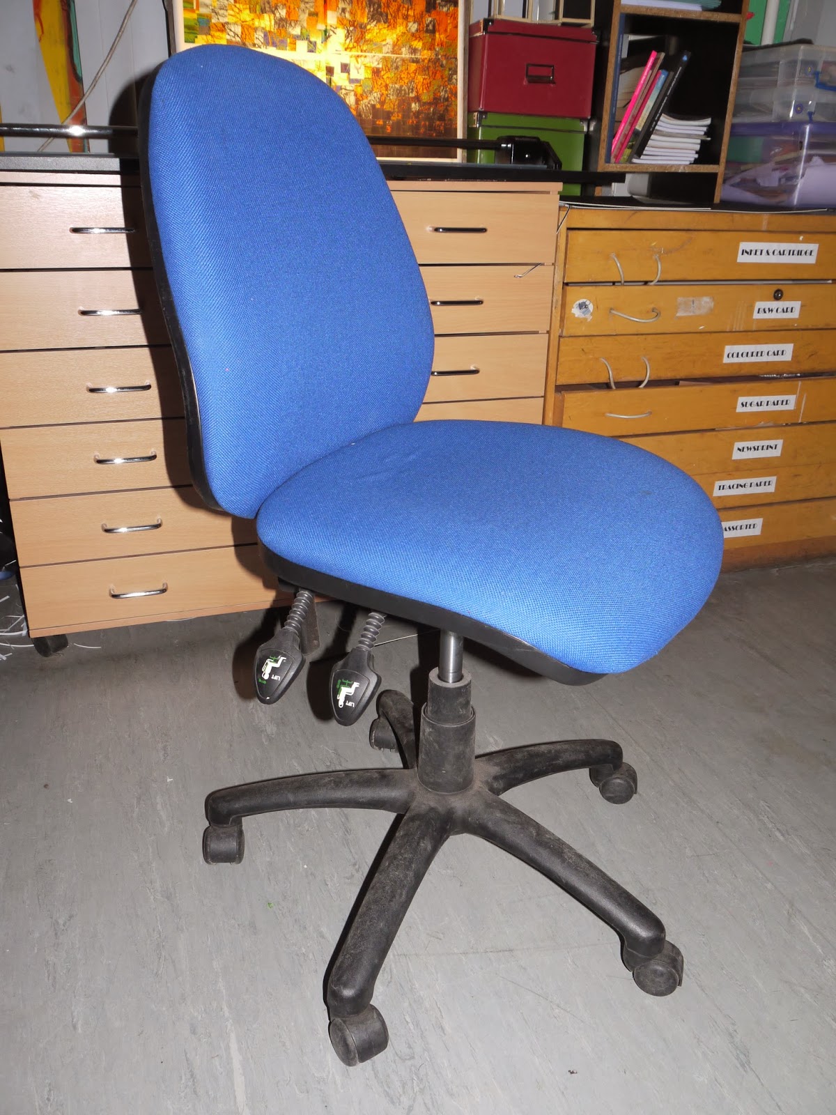
These are the primary images of chairs which I have taken to experiment and create my children's illustrations further. I have taken photos of a range of chairs to experiment with the types of chairs and which type of chair would work best in the final illustration.
5.2.14
4.2.14
Experimentation: Mono-Printing
Linking to my last blog post which was also of mono-prints, these mono-prints I have improved and experimented with different compositions. I have done this as I was not happy with how my previous mono-prints had come out and I wanted to improve them. I experimented with different compositions as I wanted to see which one would look best as my final layout.
1) The initial drawing of experimentation with compositions.
2) I think that these mono-prints are successful but would be more successful if they were shown the correct way (i.e the letters are backwards). I didn't take into account that the drawing would flip when creating a mono-print.
3) I feel as though this mono-print is the most successful mono-print so far as I had took into account that the image would flip, and the lines are very sharp and gritty. The black smudges around the bear give it a very rough-look which is what I like about it - It adds to the depressing effect of it.
4) With this mono-print, I experimented with twisting the paper on the ink with my hand before lifting it to give it more of a rough, gritty effect. Unfortunately it did not come out the way I had hoped as it doesn't look rough enough.
5) I tried to experiment with another technique with the mono-print, which was placing it of the floor and rubbing it onto the surface of the floor. I had hoped that this would give it a scratchy effect, but unfortunately this did not work either, it only made the mono-print look unsuccessful and dirty.
I enjoy the effect that mono-printing gives and I think that it adds to the depressing, rough, gritty look that I want to achieve with my illustrations which is why I am going to continue experimenting and improving my skills of mono-printing to create a successful outcome for my final piece.
| 1 |
| 2 |
| 3 |
| 4 |
| 5 |
2) I think that these mono-prints are successful but would be more successful if they were shown the correct way (i.e the letters are backwards). I didn't take into account that the drawing would flip when creating a mono-print.
3) I feel as though this mono-print is the most successful mono-print so far as I had took into account that the image would flip, and the lines are very sharp and gritty. The black smudges around the bear give it a very rough-look which is what I like about it - It adds to the depressing effect of it.
4) With this mono-print, I experimented with twisting the paper on the ink with my hand before lifting it to give it more of a rough, gritty effect. Unfortunately it did not come out the way I had hoped as it doesn't look rough enough.
5) I tried to experiment with another technique with the mono-print, which was placing it of the floor and rubbing it onto the surface of the floor. I had hoped that this would give it a scratchy effect, but unfortunately this did not work either, it only made the mono-print look unsuccessful and dirty.
I enjoy the effect that mono-printing gives and I think that it adds to the depressing, rough, gritty look that I want to achieve with my illustrations which is why I am going to continue experimenting and improving my skills of mono-printing to create a successful outcome for my final piece.
30.1.14
Experimentation: Mono-Printing
I used my primary images to create mono-prints of children's toys. I think that the process was very successful as the style of the mono-prints responds to the style of Edward Gorey; It's a very dark, gritty style which also links to the story of the book - depression.
The mono-prints didn't come out as well as I had hoped, I think that I may have used too much ink, which is why I will continue to experiment with this technique to try to improve them.
Primary Images: Children's Toys
Following on from the 'Front Cover Layouts and Designs for Children's Book' blog post, these are the primary images which I have taken to experiment and create my Children's Book Illustrations further. The reason that I have chose to photograph a chair, teddy bears and toys is to relate to my target audience - children.


Artist Response: Quentin Blake
![]() |
| Quentin Blake's work |
Quentin Blake's illustration for Michael Rosen's 'Sad Book' of Rosen sitting on the bed looking sad is a very memorable illustration. The use of color and line add to the mood of the illustration which is very sad and depressing.
| My primary photograph for response |
The photograph on the right, of my mother, is the image that I worked from to respond to Quentin Blake's illustration. I responded to Blake by using the same technique in which he uses to create his illustrations. I placed my primary image on a light-box and then placed a piece of watercolor paper on top.
![]() |
| Quentin Blake speaking about his technique |
| My response |
The image on the right is my response.
I think that the most successful part of my response in the face. In the image above, Blake explains that he always starts with the most hardest part of the illustration first, which is usually facial expressions - this is a process which I also chose to use from Blake.
I think that the response could be improved by using less shades of grey; there are too many different types of grey in the image which overpowers the actual illustration.
I enjoyed using the light-box and I think that it is a very useful technique which I will be continuing to use in my practical work.
23.1.14
Visit: The National Art Library
On the 9th January 2014 our Graphics class visited The National Art Library to find more resources that could be used as references in our A2 Graphics Essay. For me, the visit wasn't greatly beneficial, but I did find a few Edward Gorey illustrations which I had not seen before and I also found a page in a book where Quentin Blake explains how he creates his illustrations.
Below are scans of what I found useful from the visit.
Subscribe to:
Posts (Atom)